
Tierra Ignota
The reason why we are planning to visit Socotra this year...
Creative Direction: Relajaelcoco
Strategic Direction: Amarna Miller
Photo & Video: Luis Piñero
Web design: Relajaelcoco
Web development: Relajaelcoco
Client: Sociedad Tierra Ignota
The Context
Tierra Ignota organizes immersive expeditions to remote locations. From the beginning, they had what most brands take years to build: a clear message, a strong community, and a powerful visual archive. What they needed wasn’t validation, but structure: a brand identity that could support without distracting, amplify without covering, and grow without losing tone.
The challenge wasn’t inventing meaning, but translating a strong internal vision into a visual and functional system.
The Approach
In a fast-growing sector where branding is still an afterthought, building a solid identity from day one gave us a strategic advantage.
We approached the challenge by adjusting our methodology: we chose to design directly in Webflow from day one, merging brand and website in a single workflow. Every decision was made on real content, with no extra steps.
tierraignota.com
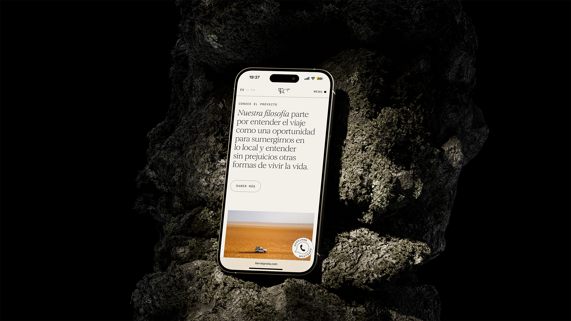
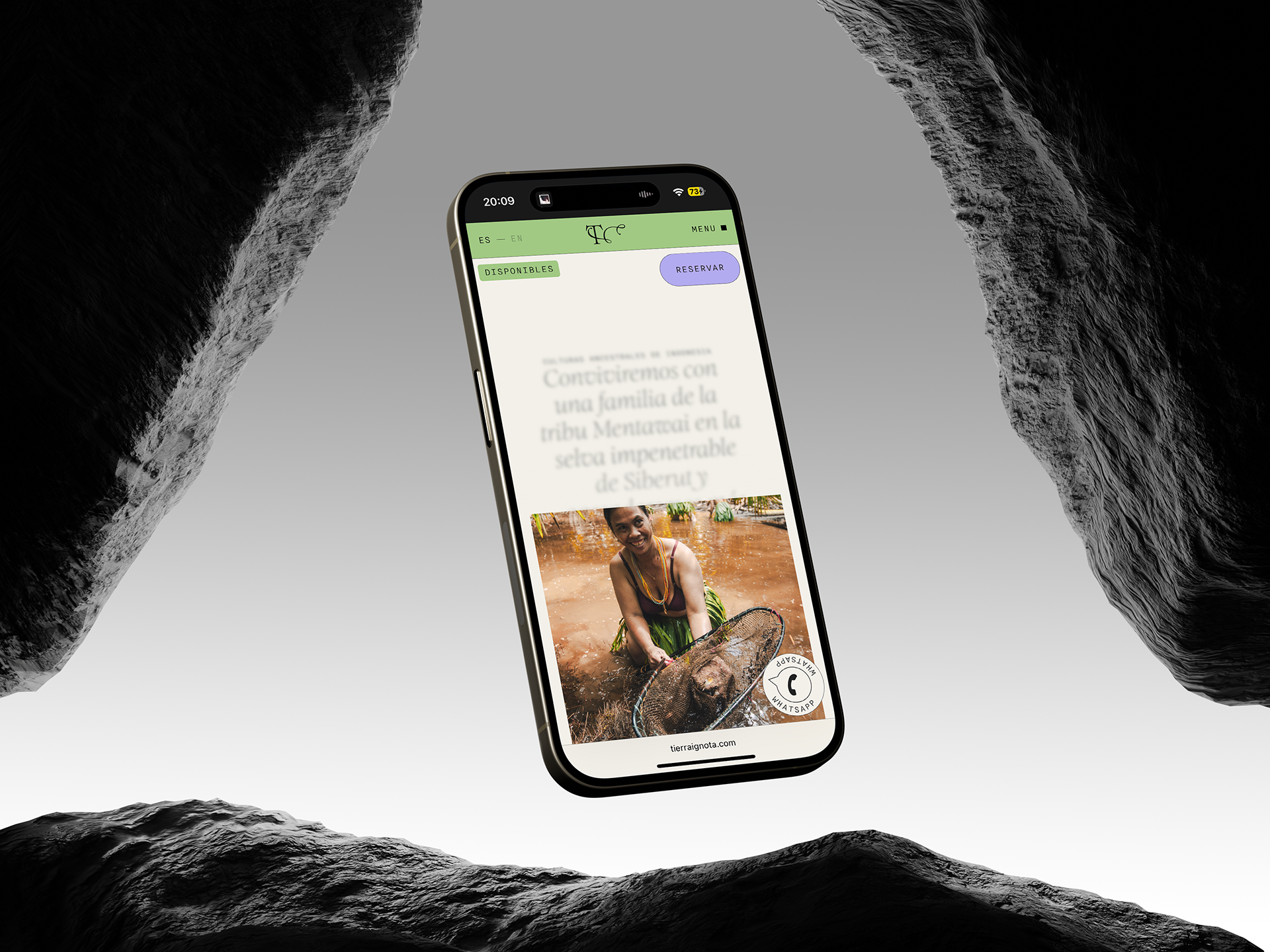
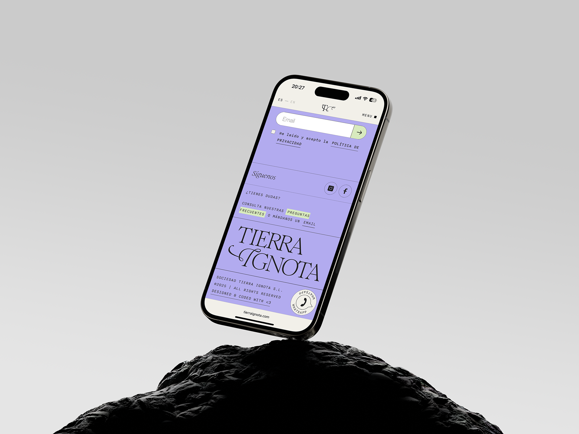
The Visual System
The creative direction of the whole project was based on a clear premise: the content was so powerful that the brand shouldn’t compete with it, only frame it, support it. We moved away from the usual visual NGO greens, handwritten fonts, or “ethnic” clichés and leaned into references that were more editorial, technical, and documentary. From there, every visual decision followed the same logic: building an identity with character, but without visual noise.
We combined typefaces that balanced all the tone references, created a neutral palette that gave imagery room to breathe while still holding a distinct atmosphere, and designed a system of transitions that reinforced a sense of paced, narrative browsing.
A user experience closer to flipping through a travel journal than browsing a typical tourism site.


The Impact
Tierra Ignota now has a brand structure built to grow with it. One that doesn’t compete with the content, but enhances it. A visual system that doesn’t require constant overhauls, and instead evolves smoothly and coherently alongside the project.
Less than a year after launch, they’ve already become a reference in its business sector. Their expeditions sell out, their community grows, and their message resonates far beyond the travel industry.
When content is strong and the direction is clear, design doesn’t have to shine—it just has to work.
And when it works, everything else follows.

